
Mark Soley, aka Agent Venom on many forums, and my husband, just wrote this up for a group we are in. I thought it would be an informative post to share with the masses.
Happy Reading!
Ok So I'm just going to post a few pointers for people to think on to get better composition both in colour and form.
There are 5 basic elements of contrast that can, and IMO should be used to generate an interesting and conceptually strong composition.
They are the 5 Layers of Contrast.
1) Light and Dark
Lights and shadow will help generate scene lighting and will give your viewer a strong visual cue of where to look fist.
2) Complementary Colours
This could be a lot of colour schemes but to break it down a little, for greens add reds to the shading to get good depth of colour in the transition. OR alternatively use accented complimentary palette such as Blue and Purple with an accent colour of amber to ad focus and interest. Here is a link to help you out with picking schemes and colours for a composition - http://paletton.com/#uid=11k0u0kllllaFw0g0qFqFg0w0aF
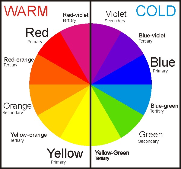
3) Warm and Cold tones
This is important as warm colour tones come forward visually and cool tone colours recede. This means that when you are shading skin for example if you use cold tones in the shading and warm in the highlights you will get better depth of colour and contrast. To break it down this link is a simplified way of looking at how to recognise if a colour is cool or warm - https://tommybeautypro.files.wordpress.com/…/warm-cool-colo…
4) Shiny and Matt/Dull
This can be a metallic surface that is transitioned to a non metallic shade or a glossy to matt finish. This adds in more interest into a surface and the more layers of interest and complexity the better the final composition.
5) Textural Contrasts
This is an optional bonus layer and can be in the textural elements of the base or on the sculpted mini. A spacemarine for example is only one texture and therefore can be quite boring if all the other elements are not really well executed. Alternatively you could add textures to it in the basing or in modifying the mini with additions.
To break it down, the more layers of contrast and the better they are executed the more interesting the composition will be. I hope that this helps people out a little, its part of my process and seems to do me well if i find that there is something missing from my composition when producing a piece.