Painting Red - Lord of Lannister Bust

Preface

I originally wrote this tutorial back in 2014 when I painted the Nutsplanet Lord of Lion Bust. When I switched my website over from a blogspot domain to Squarespace, this was one of the tutorials I did not port over. I can’t remember why I didn’t at the time but it has been my most sought after and asked for tutorial to date. I realized that there may still be a record of it on the worldwide web if I went searching for it. Lo and behold! It still exists but it was not easy to find. So, here it is, recreated so I can directly link it for whomever would like it. Any additional information I’ve added at the time of this reposting will be in italics.

Disclaimer: I wrote this tutorial just after having worked for Privateer Press as a studio painter, hence the list of P3 Paints used. Today I use artist acrylics, however, this tutorial can still be used as a general guide and you can substitute in your preferred paint range.

I have also told
my Twitch followers that I will do a painting red tutorial on a stream in the future. I am currently writing this in July 2022. I will announce on my Instagram when I plan to do a Painting Red tutorial live on stream.

Red is a color that seems to give a lot of people painting problems and it used to give me a lot of headaches as well. Then I had to learn to paint red quickly and efficiently while I was at Privateer Press because I painted tons and tons of Skorne.

Recently, I painted the Lord of Lion Bust from Nuts Planet which is Tywin Lannister from Game of Thrones. I wanted to paint him the way I image from reading the books which means some red leather armor. So, I began the way I always do . . . here are the steps to painting a great looking red.

Supply List:
P3 Sanguine Highlight
P3 Sanguine Base
P3 Coal Black
P3 Ember Orange
P3 Menoth White Highlight
P3 Red Ink
P3 Turquoise Ink
P3 Armor Wash
Liquitex Magenta Ink
Liquitex Violet Ink

Step 1: Basecoat the entire area in a midtone red. Here I've used P3 Sanguine Highlight as my basecoat color. You can use any type of red, you just don't want it to be dark since we will work on shading next.

Step 2: Shade using a darker red. I've used P3 Sanguine Base as my first shade.

Step 3: Mix a Blue and Red together for the darkest shade. I've used P3 Coal Black and P3 Sanguine Base for the shading.

Step 4: Start highlighting by mixing an orange mixed with your base red. Here I've used a mix of P3 Ember Orange and P3 Sanguine Highlight.

Step 5: You guys are gonna start to freak out but trust me on this. Mix Menoth White Highlight into your previous mix. Yes, it will get pink. Yes, it will get chalky. That's okay. Trust me. Keep going.

Step 6: Mix even more Menoth White Highlight into your previous mix. It should be a super light pink and will look totally weird against the rest of the red. You need to make sure at this step your shadows are really dark and your highlights are really bright. In the next step, the magic starts to happen.

Step 7: Thin out some of your inks with water and start glazing them on. Thinning the ink is important. You will be able to control how much of a tint you are applying if you thin your inks first. Additionally, you will be able to get rid of some of the glossiness inks naturally have in their finish by thinning with water.

I started by glazing Red Ink first. I did several layers and then started adding Magenta Ink and Purple Ink to the layering to keep it from getting too orange. You are going to have to do many layers of inks. This is where a hair dryer comes in really handy for painting. You will need to make sure each layer of ink is completely dry before adding more layers of ink. Use the purples, blues, turquoises and Armor Wash to glaze the shadows on the red as well. You don't want to lose the contrast you just created in the previous steps. You want to enhance it with the ink.

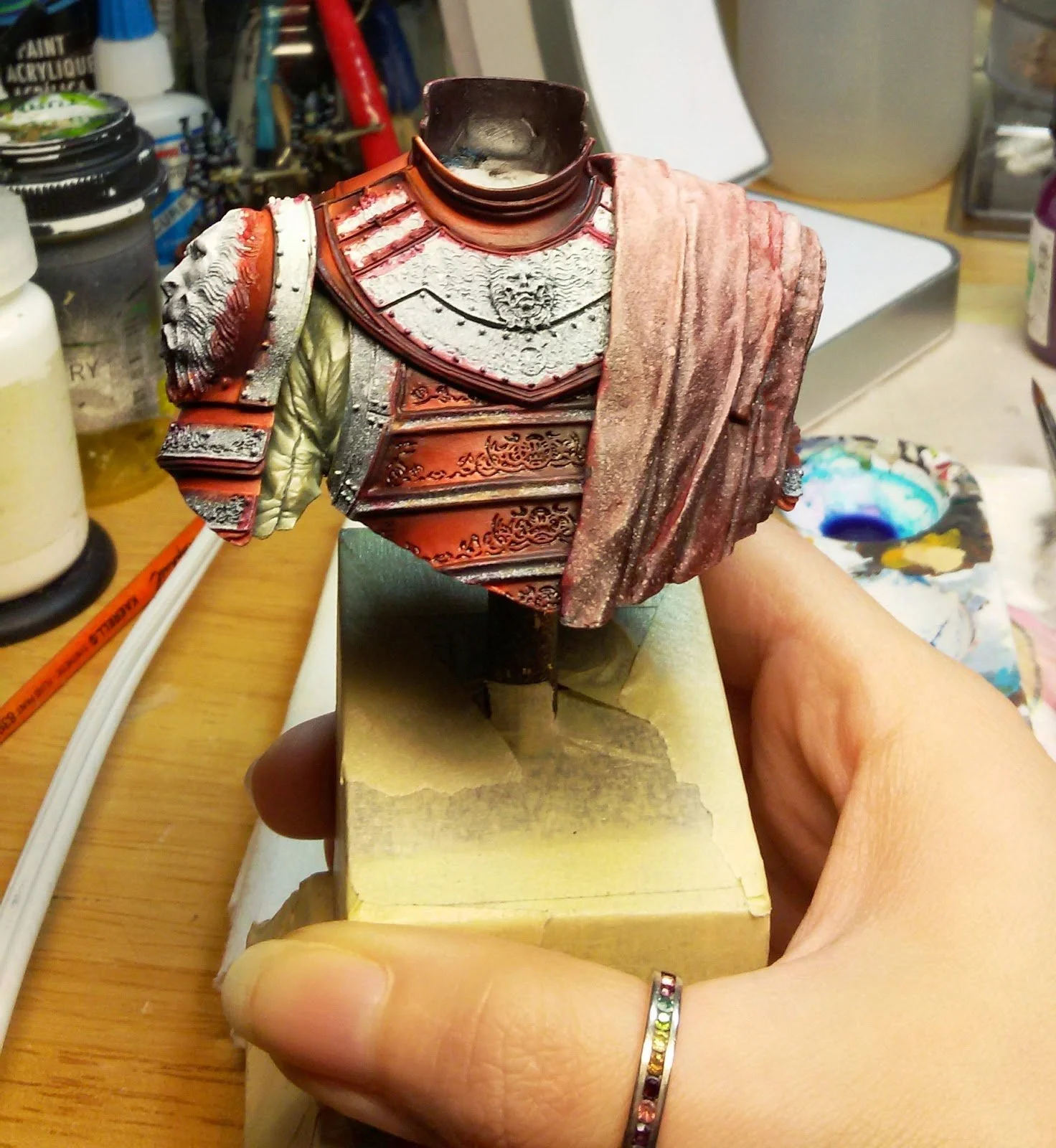
Keep adding layers until you have this:

And this is what the red looks like with another color against it, just so you can see the areas I painted framed well in the figure.

I chose the P3 Blighted Gold as my metal color because it is a green gold. Red and Green are complementary colors. Using a green gold against a bright red lacquered armor assisted in achieving a better balance of contrast than using an orange or yellow gold.

And here are some Work Bench photos of him all done and put together. I used the same method, just different colors, for the red cloth.

Thank you for taking the time to read this. I hope it was helpful for you and please feel free to share it with anyone you think may be interested. My tools have changed through the years but my method for color application remains the same. If you have any questions feel free to reach out on any of my social media linked here.

Create Your Own Wet Palette (Oz & NZ edition)

I have previously written a blog, Wet vs Dry Palettes: What Are They and When To Use Them , after getting many questions, both in class and online. However, there are still questions on how to make your wet palette and how to keep it from drying out. This is crucial for Aussies or anyone living in a warmer and drier climate. 

The reason this is labelled the Oz and NZ edition (Australia and New Zealand) is because all of the items I will be showing in this blog are easily found at most grocery stores in both countries. You can find equivalents in your home country pretty easily just by looking at your options available.


Supplies

1 LARGE Sistema Container
1 Roll of Multix Baking Paper (Oz)/Mono Baking Paper (NZ)
2 European Cloth Sponges/Compressed Cellulose Sponge Sheet
 

The reason I stipulate that you need a LARGE wet palette is because, inevitably, when I don't stipulate, people find the smallest container in the shop and then get frustrated when the sponge and paper dry out quickly or when they run out of room after mixing three colors. Find a big palette. I promise you, you will use the space. The larger wet palettes also hold more water which means your sponge will stay wet longer. 

In order to construct your palette, you need to take the Sistema container and flip it upside down so the lid is the bottom of the palette. This is where your sponge will sit. The reason we want to use a container like the Sistema is so that we can use the bottom of the container as the wet palette lid. This means that when you are not using your palette, you can put the lid on it, close it up and your paint will stay wet for days, weeks even. 

This is a 3.5L Sistema. This is the smallest I would suggest using for a wet palette. I use a 7L one. 

Depending on the size of your Sistema you may need to cut and arrange your sponges to fit. You will need to wet the sponge first then measure and cut as the sponge will expand when it gets wet. A few notes on sponges quickly, I recommend using ONLY Compressed Cellulose Sponge Sheet in your wet palette. This is after watching other people's palette constructions and how they perform. So far, the way I put my palette together seems to stay wet the longest out of any configuration. 

The sponge sheet lays low in the palette tray. That means that the water stays soaked in the sponge. If you get a larger cellulose sponge that actually rises above the top line of the Sistema Lid, your sponge will dry out faster as it has more air exposure and the faster your sponge dries, the faster your paper dries which means the faster your paint dries. I see people getting frustrated as their palettes start drying out within an hour of using it. My palette configuration stays wet for days, even in the hot Australian Summer heat. 

You will also see people suggesting to use paper towels layered up instead of a sponge. It will work but it does dry out faster. And the paper towel will eventually disintegrate or get moldy. I tried this method once upon a time and it definitely isn't the best. It also increases waste by having to change the towels frequently. 

I have also seen palettes that use packing foam, not a sponge. The packing foam doesn't actually hold water, it just sits in the water. So it does nothing for keeping your paper wet. You need a sponge as it soaks up the water which means the water is up against your baking paper which keeps the paint wet. 


This is two sponges, one full sponge and the second is cut up to fit as much space in the palette as possible. Use a sponge that lays flat within the dimensions of the tray instead of sitting above the top edge of the lid. 

Once you have your sponge fitted in your Sistema Lid, you need to add more water. The line of the water should be at the top line of the sponge. You should see a sheet of water sitting on top of the sponge but your parchment shouldn't float around when you place it on your palette. 

The sponge is saturated with water and I can see a thin sheet of water over the sponge. However, the entire plane isn't flooded. 

Then you need to add your baking paper. I actually cut mine just a little smaller than the lid as it will relax and expand as it gets wet. I belive it is important to cut the paper so it fits instead of leaving any edges that dangle over. Again, this has to do with keeping the palette wet longer. I don't have issues with my paper drying out or edges curling at all as all of my parchment lays flat against a wet sponge. Keeping all of the materials flush against each other, helps to trap the water which means you have less evaporation, which keeps your whole palette wet longer. 

Once I cut it, I lay it down on the sponge and smooth it with my fingers. Then I flip it over and do the same on the other side. This way, both sides of the paper get saturated with water which allows the paper to expand, relax and keep more moisture closer to your paint. 

Then you just add your paint, about 1cm away from the edge of the paper. I lay my paint out so it is around the edges of the palette which leaves the middle as my mixing area. 


Ta Da! We have a Wet Palette that is ready to use. But wait, how will I keep it clean, you ask? 

Well, firstly, I recommend rinsing the sponge out after every project and changing the paper every project. That will go a long way. That said, Mark and I add just a tiny spritz of Ammonia Free Windex to our palettes. The Windex acts as a detergent which keeps mold at bay but not away forever. It will also make your palette smell nice and fresh. 

When you notice your sponge is starting to go grey then it is probably time to throw it out and find a new one. Keeping a dirty palette increases your chances of getting sick. In order to take care of yourself, you need to take care of your tools. 

One Last Tidbit . . .

Something that is NEVER discussed but I've been playing with lately is the color of your sponge. If you use a sponge that is not white, it will affect the tones you are mixing. This is called Color Relativity. Any time you have multiple colors in proximity to each other, they bounce off one another and it affects the way we perceive all the colors combined in a composition. This is what we mean when we say a color scheme harmonizes. When all of the colors work well together and don't clash, it is because once they all reflect off each other, they look like a cohesive scheme and it produces harmony. 

This is something we always think about when we are painting the model and trying to choose a color scheme but we rarely, if ever, think about how the color in our palette will affect our overall tone of painting. 

The easy break down is this: 
Using a yellow sponge will mean your colors will likely shift slightly towards yellow in overall tone. 
Using a pink sponge will mean your colors will likely shift more towards red. 
Using a blue sponge will get provide a cooler color scheme overall. 
And so on and so forth. 

So, if you want a true representation of your color, find a white sponge. I also paint swatches in my white paper sketchbook to check what I'm seeing is accurate for the tone I want. Currently, I'm switching around my sponges depending on what I want my overall color scheme to be. I'm currently painting a ranger set in the forest which is a very green ambient color, so using the green sponge means I need to mix a slight amount of green in all of my colors to have them appear correct against the green sponge. That means I will have a slightly green tone to my colors suggesting green is present in the environment. 

I hope this has provided some insight as well as some food for thought. If you guys have any questions feel free to message me. 

Happy Friday from Oz

Artist Tube Acrylic vs Game Paints

I recently decided to thin my stash of P3 Paints and replace them with artist tube acrylics. My main concern was financial. Everything is more expensive in Australia and it hurts buying a pot of paint for $6 or more dollars when artist acrylic is the same price or a little more expensive for vastly more quantity and potentially better quality. 

I had heard a lot of people in Europe discussing the use of Jo Sonja paints and Schminke Acrylics so I asked people for their thoughts. The general review of the Jo Sonja paint was that they were noticeably cheaper than the Schminke, they dried very matte and have a velvety finish. Meanwhile, the Schminke had a nice body, strong pigmentation but dried very glossy. Both paints had pros and cons to them. Before I jumped into buying anything I wanted a chance to use them. Roman from Massive Voodoo knew of my curiosity so when I had my private lesson with him we used only 13 Schminke Color. I really enjoyed using them and the colors I was able to mix.

So, here's the thing . . .

By limiting yourself to a max of 13 colors out of the tube, you have to mix everything else. That is the beauty of using tube acrylics. You don't get stuck in a rut using only your favorite premix pot of paint, you have to custom mix everything and you have to do it repeatedly and constantly through a project. 

This means you've got to have a handle on color theory and observational color deconstructions. What's that, you ask? Deconstructing Color is having the ability to look at a local color of an object and replicate it in order to create the color in your painting. Not all yellows are created equal. Some have more blue in them and some have more orange in them. Some have black in them to desaturate them. This rings true for all colors. If you are not already comfortable with color theory, you may find yourself struggling to use only 13 colors. 

For instance, how would you create a skin tone color if you don't have one already pre-mixed? Is creating brown a simple or complicated process? How do I make a dark blue on the reddish side without it going purple? These are the sorts of things you need to know how to do, or have a basic understanding of how to get there in order to use such a limited premix selection. 

Roman helped me get set up in Germany by taking me to the most amazing art store I've ever set foot in, Boesner. Here's the list: 

Titanium White
Ivory Black
Carmine
Quincridone Magenta
Cadmium Orange
Titanium Yellow
Olive Green
Cobalt Turquoise
Aquamarine
Ultramarine Blue
Light Ochre
Burnt Sienna
Natural Burnt Umber

I really enjoy these paints. Their pigmentation and strength make them very easy to mix and they stay wet in your palette for days (if you have a wet palette). The cons are that they do dry very shiny. So shiny that every couple of layers you have to apply some matte varnish to get more paint to stick. For me, this is something to adjust to. I like to paint in thin layers but that means using lots of matte varnish. If you apply the paint a bit thicker then you can get more done before having to matte varnish. I have been mixing the matte varnish directly into the paint on my palette to try to thin the pigments as well as kill the shine on them. 

Now on the flipside . . .

The reason for my interest in Jo Sonja is that they are SUPER easy to find in Australia and that is saying a lot. Seriously, the things the art community doesn't have access to here is staggering. I think the European, American and even Asian communities would be floored to find how difficult things are to track down here. Jo Sonja is everywhere though. Easily available and not expensive, either. Again, another bonus for the Aussie community.

I went out and bought a smattering of Jo Sonja as well. Same list as above as well as the Fluoro green for glow effects. I've been mixing them with the Schminke which has neutralized the extreme finishes of both to give me something a bit more satiny, which is what I prefer because of the P3 range I've worked with for so long. 

I did also find that the Jo Sonjas can be used completely on their own but you have to get the Jo Sonja Glaze Medium to make them easier to use. It dilutes the paint and allows for more glazing. It doesn't take much to dilute them as they are already a fluid acrylic in a tube. Unlike the Schminke which are heavy body paint, which is the fansy pants art way of say they are thick like paste as opposed to fluid paint. 

I sat down and painted an entire project with nothing but my new tube acrylics. It was a little bit of a challenge trying to reliably mix new batches of colors in between painting sessions but it gets easier the more you do it. 

Here are my results. 


I really enjoyed using both and I am glad to have a much less cluttered desk with only the colors I absolutely need to mix anything and everything. It also means it's cheaper for me as 1 tube of Jo Sonja (75 ml) is the same price of the game paints such as P3 (17 ml). I did keep my metallics from the P3 range and some from Vallejo as well. That is one area where tube acrylic lines fail is producing a good metallic paint. Otherwise, I'm pretty pleased to have made the switch.