
Preface
I originally wrote this tutorial back in 2014 when I painted the Nutsplanet Lord of Lion Bust. When I switched my website over from a blogspot domain to Squarespace, this was one of the tutorials I did not port over. I can’t remember why I didn’t at the time but it has been my most sought after and asked for tutorial to date. I realized that there may still be a record of it on the worldwide web if I went searching for it. Lo and behold! It still exists but it was not easy to find. So, here it is, recreated so I can directly link it for whomever would like it. Any additional information I’ve added at the time of this reposting will be in italics.
Disclaimer: I wrote this tutorial just after having worked for Privateer Press as a studio painter, hence the list of P3 Paints used. Today I use artist acrylics, however, this tutorial can still be used as a general guide and you can substitute in your preferred paint range.
I have also told my Twitch followers that I will do a painting red tutorial on a stream in the future. I am currently writing this in July 2022. I will announce on my Instagram when I plan to do a Painting Red tutorial live on stream.
Red is a color that seems to give a lot of people painting problems and it used to give me a lot of headaches as well. Then I had to learn to paint red quickly and efficiently while I was at Privateer Press because I painted tons and tons of Skorne.
Recently, I painted the Lord of Lion Bust from Nuts Planet which is Tywin Lannister from Game of Thrones. I wanted to paint him the way I image from reading the books which means some red leather armor. So, I began the way I always do . . . here are the steps to painting a great looking red.
Supply List:
P3 Sanguine Highlight
P3 Sanguine Base
P3 Coal Black
P3 Ember Orange
P3 Menoth White Highlight
P3 Red Ink
P3 Turquoise Ink
P3 Armor Wash
Liquitex Magenta Ink
Liquitex Violet Ink
Step 1: Basecoat the entire area in a midtone red. Here I've used P3 Sanguine Highlight as my basecoat color. You can use any type of red, you just don't want it to be dark since we will work on shading next.


Step 2: Shade using a darker red. I've used P3 Sanguine Base as my first shade.


Step 3: Mix a Blue and Red together for the darkest shade. I've used P3 Coal Black and P3 Sanguine Base for the shading.


Step 4: Start highlighting by mixing an orange mixed with your base red. Here I've used a mix of P3 Ember Orange and P3 Sanguine Highlight.


Step 5: You guys are gonna start to freak out but trust me on this. Mix Menoth White Highlight into your previous mix. Yes, it will get pink. Yes, it will get chalky. That's okay. Trust me. Keep going.


Step 6: Mix even more Menoth White Highlight into your previous mix. It should be a super light pink and will look totally weird against the rest of the red. You need to make sure at this step your shadows are really dark and your highlights are really bright. In the next step, the magic starts to happen.


Step 7: Thin out some of your inks with water and start glazing them on. Thinning the ink is important. You will be able to control how much of a tint you are applying if you thin your inks first. Additionally, you will be able to get rid of some of the glossiness inks naturally have in their finish by thinning with water.
I started by glazing Red Ink first. I did several layers and then started adding Magenta Ink and Purple Ink to the layering to keep it from getting too orange. You are going to have to do many layers of inks. This is where a hair dryer comes in really handy for painting. You will need to make sure each layer of ink is completely dry before adding more layers of ink. Use the purples, blues, turquoises and Armor Wash to glaze the shadows on the red as well. You don't want to lose the contrast you just created in the previous steps. You want to enhance it with the ink.


Keep adding layers until you have this:
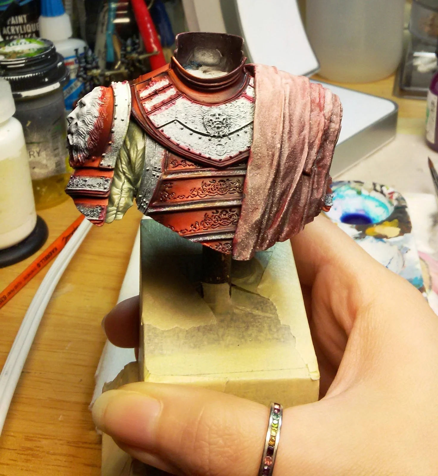

And this is what the red looks like with another color against it, just so you can see the areas I painted framed well in the figure.
I chose the P3 Blighted Gold as my metal color because it is a green gold. Red and Green are complementary colors. Using a green gold against a bright red lacquered armor assisted in achieving a better balance of contrast than using an orange or yellow gold.

And here are some Work Bench photos of him all done and put together. I used the same method, just different colors, for the red cloth.


Thank you for taking the time to read this. I hope it was helpful for you and please feel free to share it with anyone you think may be interested. My tools have changed through the years but my method for color application remains the same. If you have any questions feel free to reach out on any of my social media linked here.